


I’ve been meaning to write something about the bus network in Halifax. Other than the ferries, the bus network is all the public transit we have. Luckily, between HRMOpendata and Halifax Transit’s KPI report, there’s maps and data, and that’s usually enough for a blog!
First things first, here is a bus route map, with classifications from Halifax Transit. One thing I struggle with here is understanding what the goal of the transit system is. There are easy parts to explain: the purple “Regional Express” routes serve as car commuting alternatives for ex-urban residents - taking long routes into the city with few stops or detours.
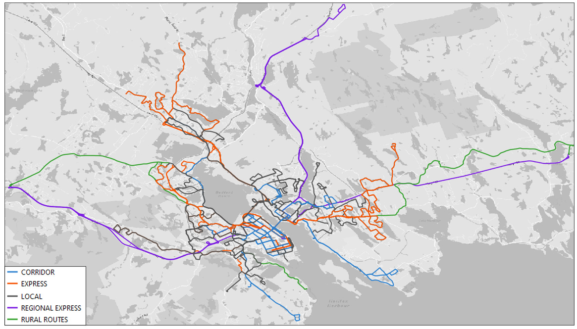
But the network of “corridor”, “express” and “local” service, especially on the peninsula and Dartmouth, don’t pop out with a clear goal (at least to my eyes- I’m a Halifax transit novice and rare user). Luckily, looking at ridership is the easiest way to see what’s happening.

What pops out is the dominance of the “Corridor” class routes. These 9 routes account for 60% of total daily ridership. Now, it should be noted that its a bit of an unfair comparison for some other routes. The express routes (orange) are explicitly peak service routes - they don’t run all day. But the point remains that relatively few routes contribute the bulk of ridership and that the remaining routes lack strong ridership.
Where are the successful routes?
The top route, the “1”, which averages 7,000 users, runs from Dartmouth, through the downtown and over to the west end Mumford terminal. And that’s a common theme across the top routes - they involve the peninsula or are quickly getting there. Almost anywhere you live on the peninsula you will have an important bus route nearby. There’s an interesting contrast with Dartmouth, where lower population density likely restricts buses success to a few main routes.

It underscores how important the peninsula, and the population density it holds, is to Halifax having a successful transit system. Obviously politicians can’t just maximize ridership, and connecting the region is important, but the “1” carries about the same riders as 40 other routes. When the dominant routes are well serviced, they take more people out of cars, letting suburban drivers move around easier too.
Bus Rapid Transit (BRT)
The final interesting part of this is comparing the ridership map to the proposed BRT plan to provide 10 minute frequency along key corridors. The BRT is in limbo because the province doesn’t wanna commit their share of funding, but it looks good. Off the top of my head:
Color coded corridor routes are way easier to keep track of / understand
The BRT routes mostly seem to line up with the existing successful routes, building on what working instead of trying to spur mode change from unlikely areas

That’s all on buses! Next week I’m hoping to focus specifically on transportation mode shares across the city, and why getting more people to live on the peninsula is so important to making sure we can all get around the city.
Deny,
Funny how if drive you don't care about busing until you need to ride the bus to work......
Thanks for looking all the things goes into a city planners head.
What's next bike and walking paths to work?
Martin